It’s been almost two years since we launched Plan to Eat back in June 2009. Starting our own family business on the side and keeping an advanced web application like Plan to Eat running 24/7 has been quite an adventure to say the least! Over the past two years we have added hundreds of new features and most of them have been from your feedback. In the next few days we will be launching a completely redesigned Plan to Eat. And because we think that great design is incredibly important (from the art to the interface and usability) we decided to have a professional branding and design company cook up something really great. With this new design almost all of the features and functionality that you are familiar with are staying the same. Of course we will continue to add new features, especially now that this new visual framework is in place. As always we welcome your feedback.
Say hello to our new logo!

Our goal for the new Plan to Eat logo (and brand) is about sophistication and beauty. It’s about creating a place you enjoy visiting and being in. A place where you can happily and successfully answer one of the most important questions we are all confronted with every day. What should I eat and how am I going to make that happen?
With the home page we have tried to focus on what you can accomplish with Plan to Eat and why it is important, instead of detailed feature lists and screen shots (that’s what the tour is for). We have also made the subscription plans more obvious and given the testimonials the attention they deserve.
The Meal Planner

We have decided to visually simplify the meal planner by reducing the use of multiple colors for each meal time and replacing them with letters for (B)reakfast, (L)unch, and (S)upper. I’m guessing we will receive some push back on this change and we may tweak it a little based on your feedback. However the positive is that this makes it easier to eventually add custom colors for multiple meal plans or people in your family displayed on one calendar.
The Recipe Book and the Shopping List
The Recipe Book has not changed much other than moving the left menu to the top and making the recipe filters more obvious and hopefully easier to use. We also emphasized the course categories so it should be easier to quickly scan your recipes. Oh, and we have ditched the old serif font for a more modern and easier to read sans-serif font (thank you Google Fonts).

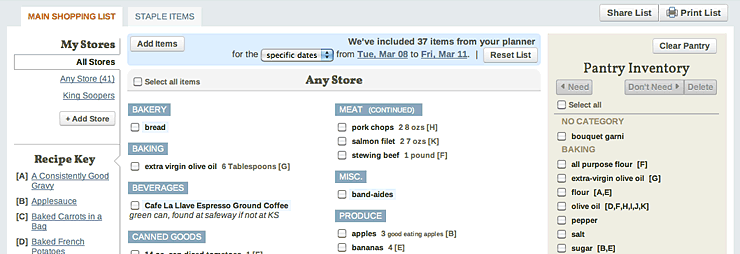
The Shopping List has also been updated with the new brand and we’ve tightening up the top navigation and button layout saving a few pixels here and there.
The Mobile Site

We think the new mobile site looks really great. The new logo reads well at a smaller size so we were able to shrink the top navigation and focus on the content. While the mobile site is not an official app it works on all mobile devices with an internet connection and can really save time at the grocery store because every item you check off on your phone is automatically moved to your pantry inventory on www.plantoeat.com. And for those of you that are extremely hungry for a real mobile app for the iPhone and Droid, hang in there, we’re working on it and we hear you loud and clear. =)
We really hope you like the changes and now that we have upgraded the Plan to Eat brand we’ll be hard at work again on the long and exciting feature list that many of you have graciously provided us through all of your valuable feedback! Oh, and as always, as we launch the new site over the next few days please let us know if you notice any problems or areas that just don’t look quite right.
